Visualizing a simple 3-D model#
This notebook builds a small three-dimensional developing cell cluster and uses the public
jax_morph.viz API directly:
drawrenders true data-space sphere meshes for publication-style static frames;animatecompares fast screen-space markers with physical sphere meshes for playback;plot_timeseriesfollows selected cells against recorded simulation time.
The model is deliberately small: adhesive Morse interactions keep the cluster together,
BrownianDynamics perturbs positions in 3-D, SaturatingCellGrowth increases cell radii, and
Division splits cells along isotropic 3-D axes. The point is to make the visualization choices
easy to see, not to model a specific experiment.
import jax
import jax.numpy as jnp

jax.config.update('jax_enable_x64', True)

import matplotlib.pyplot as plt
import numpy as np
from IPython.display import HTML

%matplotlib inline

import jax_morph as jxm
from jax_morph.physics import BrownianDynamics, Division, Morse, SaturatingCellGrowth

key = jax.random.PRNGKey(6)
print('jax-morph', jxm.__version__)
jax-morph 0.4.0
Model and initial condition#
BrownianDynamics receives n_space_dim=3, which determines the position and recorded-noise
shapes. Its Morse potential has a minimum when two cells touch, providing a soft repulsive core and
an adhesive well. Growth and motion advance together, then Division(n_space_dim=3) samples
isotropic cleavage axes and performs volume-conserving splits.
The initial cluster contains a center cell, six axis neighbors, and eight cube-corner neighbors.
This gives a compact shape with visible depth from the first frame. State.init_empty allocates all
fields required by the model; the initial condition then updates only the occupied leading slots.
potential = Morse(epsilon=0.7, alpha=3.5)
model = jxm.Model([
    BrownianDynamics(potential, n_space_dim=3, gamma=8.0, kT=0.015),
    SaturatingCellGrowth(max_radius=0.36),
    Division(n_space_dim=3),
])

axis = 0.58
corner = 0.42
positions = np.array(
    [[0.0, 0.0, 0.0]]
    + [[sign * axis, 0.0, 0.0] for sign in (-1.0, 1.0)]
    + [[0.0, sign * axis, 0.0] for sign in (-1.0, 1.0)]
    + [[0.0, 0.0, sign * axis] for sign in (-1.0, 1.0)]
    + [
        [sx * corner, sy * corner, sz * corner]
        for sx in (-1.0, 1.0)
        for sy in (-1.0, 1.0)
        for sz in (-1.0, 1.0)
    ],
    dtype=float,
)

State = jxm.build_state_from_model(model)
capacity = 48
initial = State.init_empty(
    capacity=capacity,
    n_space_dim=3,
    n_types=1,
)
n_initial = len(positions)
initial = initial.update(
    alive=initial.alive.at[:n_initial].set(True),
    position=initial.position.at[:n_initial].set(positions),
    radius=initial.radius.at[:n_initial].set(0.28),
    celltype=initial.celltype.at[:n_initial, 0].set(1.0),
    growth_rate=initial.growth_rate.at[:n_initial].set(0.12),
    division_rate=initial.division_rate.at[:n_initial].set(0.45),
)

print('position shape:', initial.position.shape)
print('live cells:', int(initial.alive.sum()))
position shape: (48, 3)
live cells: 15
Static physical spheres#
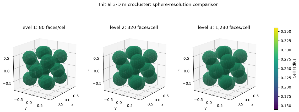
The default 3-D mode for draw is render_3d='spheres'. Each cell is a data-space icosphere:
radius controls its physical size, while sphere_resolution only controls faceting. The three
static-quality levels below use 80, 320, and 1,280 triangles per cell. They share every other visual
setting, making the improvement from levels 1 through 3 directly comparable. Level 0 is the coarse
20-face preview intended for low-cost sphere animation. A named color_by='radius' selector makes
later growth and division easy to compare.
resolutions = (1, 2, 3)
face_counts = (80, 320, 1280)
fig = plt.figure(figsize=(15.5, 5.2))
axes = []
for panel, (resolution, n_faces) in enumerate(zip(resolutions, face_counts), start=1):
    ax = fig.add_subplot(1, 3, panel, projection='3d')
    jxm.viz.draw(
        initial,
        ax=ax,
        color_by='radius',
        cmap='viridis',
        vlim=(0.14, 0.36),
        sphere_resolution=resolution,
        alpha=0.72,
        colorbar=False,
        grid=True,
        title=f'level {resolution}: {n_faces:,} faces/cell',
    )
    ax.set(xlabel='x', ylabel='y', zlabel='z')
    ax.view_init(elev=18, azim=35)
    axes.append(ax)

mappable = plt.cm.ScalarMappable(norm=plt.Normalize(0.14, 0.36), cmap='viridis')
colorbar = fig.colorbar(mappable, ax=axes, shrink=0.78, pad=0.04)
colorbar.set_label('Cell radius')
fig.suptitle('Initial 3-D microcluster: sphere-resolution comparison', y=0.98)
plt.show()
Simulate a short trajectory#
Requesting history=True retains every complete state, including the physical simulation time.
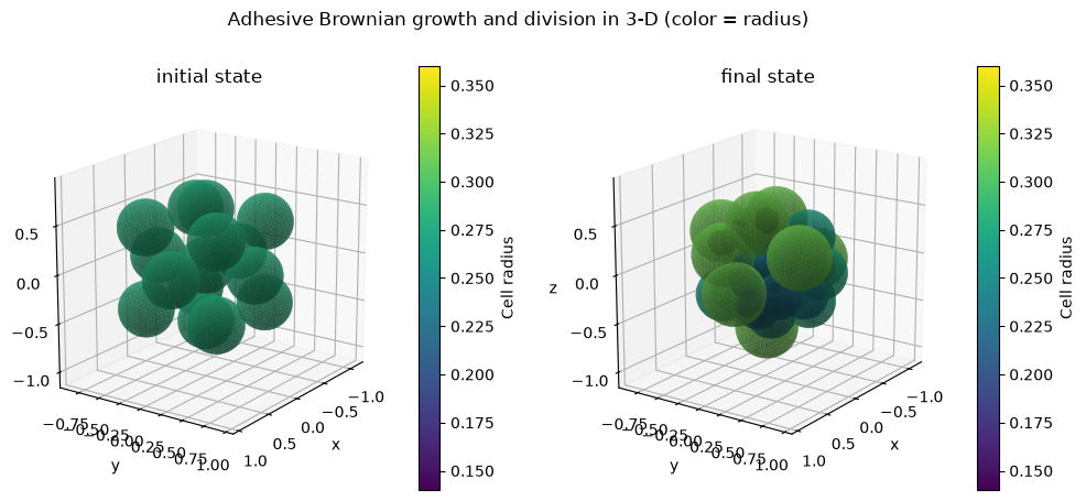
Thirty-two small steps show Brownian rearrangement, gradual growth, and several cell divisions
without making the example expensive.
history = jxm.simulate(
    model,
    initial,
    n_steps=32,
    dt=0.05,
    key=key,
    history=True,
)
final = jax.tree_util.tree_map(lambda value: value[-1], history)

print('history position shape:', history.position.shape)
print('recorded time:', float(history.t[0]), 'to', float(history.t[-1]))
print(
    'mean live radius:',
    float(initial.radius[initial.alive].mean()),
    '->',
    float(final.radius[final.alive].mean()),
)
print('live cells:', int(initial.alive.sum()), '->', int(final.alive.sum()))
print('division overflow:', int(final.division_overflow))
history position shape: (33, 48, 3)
recorded time: 0.0 to 1.6000000000000008
mean live radius: 0.28000000000000014 -> 0.26155652868867946
live cells: 15 -> 29
division overflow: 0
The two panels below share limits computed from every live cell in the trajectory. Because draw
returns native Matplotlib axes, normal controls such as view_init remain available after drawing.
live = np.asarray(history.alive, dtype=bool)
all_position = np.asarray(history.position)
all_radius = np.asarray(history.radius)
lims = tuple(
    (
        float(np.min(all_position[..., dim][live] - all_radius[live]) - 0.12),
        float(np.max(all_position[..., dim][live] + all_radius[live]) + 0.12),
    )
    for dim in range(3)
)
fig = plt.figure(figsize=(12, 5))
for panel, state, title in (
    (1, initial, 'initial'),
    (2, final, 'final'),
):
    ax = fig.add_subplot(1, 2, panel, projection='3d')
    jxm.viz.draw(
        state,
        ax=ax,
        color_by='radius',
        cmap='viridis',
        vlim=(0.14, 0.36),
        sphere_resolution=3,
        alpha=0.72,
        lims=lims,
        grid=True,
        colorbar_label='Cell radius',
        title=f'{title} state',
    )
    ax.set(xlabel='x', ylabel='y', zlabel='z')
    ax.view_init(elev=18, azim=35)
fig.suptitle('Adhesive Brownian growth and division in 3-D (color = radius)', y=0.98)
plt.show()
Fast 3-D trajectory preview#
Animation defaults to markers in 3-D. Marker area is proportional to radius**2, but marker sizes
are screen-space approximations rather than physical sphere meshes. This is the responsive choice
for iterating on a model; pass render_3d='spheres' when physical radii matter more than playback
cost. The default marker scale is tuned for readable cells rather than tiny points, and thin
outlines keep overlapping cells distinct. fixed_lims=True and fixed_clim=True keep the camera
and color mapping stable.
marker_figure = plt.figure(figsize=(7.5, 6.0))
marker_animation = jxm.viz.animate(
    history,
    color_by='radius',
    cmap='viridis',
    vlim=(0.14, 0.36),
    render_3d='markers',
    fixed_lims=True,
    fixed_clim=True,
    fig=marker_figure,
    grid=True,
    colorbar_label='Cell radius',
    title='3-D Brownian growth and division (fast marker preview)',
)
marker_animation._fig.axes[0].view_init(elev=18, azim=35)
marker_widget = HTML(marker_animation.to_jshtml())
plt.close(marker_animation._fig)
marker_widget
<IPython.core.display.HTML object>
Physical-sphere trajectory preview#
The identical recorded history can instead be animated as data-space spheres. Resolution level 1 uses 80 faces per cell: enough to make cell size and contact geometry physical while remaining much lighter than the static level-3 mesh. The limits, color range, camera, figure size, and playback interval match the marker animation above, so the rendering tradeoff is easy to compare.
sphere_figure = plt.figure(figsize=(7.5, 6.0))
sphere_animation = jxm.viz.animate(
    history,
    color_by='radius',
    cmap='viridis',
    vlim=(0.14, 0.36),
    alpha=0.72,
    render_3d='spheres',
    sphere_resolution=1,
    fixed_lims=True,
    fixed_clim=True,
    fig=sphere_figure,
    grid=True,
    colorbar_label='Cell radius',
    title='3-D Brownian growth and division (physical spheres, level 1)',
)
sphere_animation._fig.axes[0].view_init(elev=18, azim=35)
sphere_widget = HTML(sphere_animation.to_jshtml())
plt.close(sphere_animation._fig)
sphere_widget
<IPython.core.display.HTML object>
Per-cell field histories#
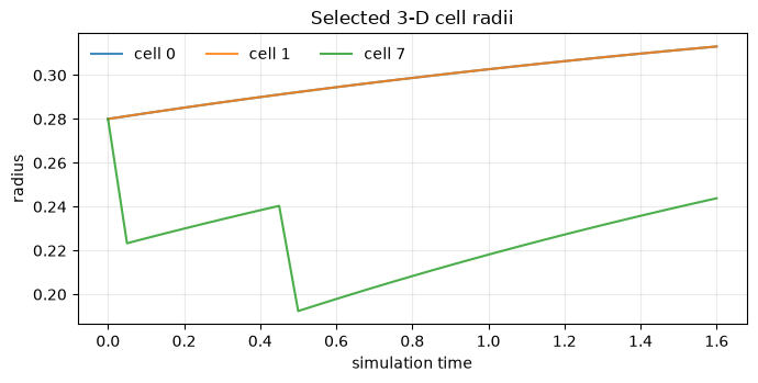
Spatial frames often need a quantitative companion. plot_timeseries uses the trajectory's
recorded t values and reconstructed cell identities. Here three founder cells grow toward the
same target; when a founder divides, its volume-conserving split appears as a downward radius jump.
fig, ax = plt.subplots(figsize=(7, 3.6))
jxm.viz.plot_timeseries(
    history,
    'radius',
    cell_ids=[0, 1, 7],
    ax=ax,
    title='Selected 3-D cell radii',
)
ax.legend(ncols=3, frameon=False)
ax.grid(alpha=0.25)
fig.tight_layout()
plt.show()
The same history can now be rendered at different fidelity without rerunning the simulation: physical spheres for selected frames or playback, markers for fast playback, and ordinary Matplotlib axes for custom analysis plots.